
In this episode you'll find out about monochrome madness, tattoos, shells and split toning your images
Share - Photography assignment that rock!
Inspire - Devil fighter and wet shells
Create - How to split tone your monochrome images
Checkout the new courses we have in the lounge (our awesome photography community) - Here>>>
To find out more checkout the Share Inspire Create Lounge Here>>
Enjoy & Share the Photo-Love by sharing this post.
Brent & Johny
I want to
make
money from
my
photography
I want to
learn to take
stunning
Portrait
image
I want to
learn to take
amazing
Landscape
pictures
In this episode:
(00:55) – The SIC Community black and white assignment
(01:26) – Brent’s two votes
(01:45) – David’s black and white image
(02:02) – Jane’s black and white cat image
(02:35) – David Cobbin’s black and white kid photography
(02:59) – Get down low and go, go, go
(03:14) - Keith Singer’s image
(03:46) – Matthew Shipp’s image
(04:15) – Peter Nagler moon photo
(05:14) – SIC Lounge live critic
(05:43) – Brent’s black and white image
(07:24) – The point of interest is the devil
(08:04) – Johny’s black and white image
(09:07) – Northern hemisphere
(10:31) – It is ok to set it up but not harm the environment
(13:35) – What exactly the toning does
(15:35) – Split toning tips
Episode Highlights:
- When split toning, do not be stuck with the default yellowy color.
- Experiment with the colors available and try to set the image for the mood
- Don’t be afraid to mess it up sometimes with the color because that’s how you learn
- When doing kids photography, never shoot down. Always go down to their level and shoot at an eye level with them.
- It is ok to set things up to capture a beautiful image
- When setting things up, make sure you are not harming the environment
- Shooting sunset can be a hit and miss. Open your eyes to the surroundings and shoot something else if the sunset is not giving you good images.
Introduction
Johny: Hey Guys, what’s up? It’s Johny here and welcome to another episode of the SIC show and as always I’m super pumped to be here and I’m here with my main man B. How are you doing Buddy?
Brent: I’m feeling monochrome today.
Johny: Monochrome.
Brent: Monotone.
Johny: As you Guys can probably tell, this week on the show we’re going to talk about black and white and how to create the best black and white images. But first in the “Share” we’re going to tell you about the awesome assignment that we just finished in the lounge.
Brent: Yeah, and Johny is going to inspire you and I’m going to inspire you with two of our amazing black and white images and Johny is going to talk about split toning and how to do it properly.
Johny: Yeah, awesome. Let’s get into it, Man.
Brent: Enjoy.
The Black and White Photography Assignment that Rock!
Johny: Alright, Buddy. The “Black and White Assignment”. I wanted to share with you Guys that we’ve just completed; the “Black and White Assignment” for the SIC Lounge or the Share, Inspire, Create Lounge community, goodness. I just want to share with you quickly with our screencast running. Let’s jump over and look at all these amazing images here, Mate.
Brent: So, hey Guys, just so you know, every month in the SIC Lounge we have an assignment and actually get the community members what the assignment is. Right now, we’ve got a little voting up there with three different topics and everyone votes and they choose one and we do that for the month.
Johny: What did you vote for?
Brent: I voted for the “Rule of Thirds” and “Helping others”.
Johny: You can vote twice?
Brent: Yes.
Johny: Really?
Brent: Oh.
Johny: I’m going to go and vote. I’ve got to go and vote for composition. I didn’t know that. I need to vote again.
Brent: Alright.
Johny: Alright, let’s jump into this screencast. Okay, as you can see Guys, look at the amazing art. I love that one with the tape. Look at this by David. You know what? It’s so inspirational going here and looking at this. Look at that and the way the light falls across this is absolutely amazing!
Brent: And the way he’s added a tone to the black and white image.
Johny: I love it! Yeah, it makes it look a little bit older too with that yellowy tone. So amazing stuff here and this cat by Jane. Such a contrast in it! This is like a Brent Mail edit, yeah, with all the contrast.
Brent: I love it and Jane actually had a thread in there about printing this image because if you’re going to take it up your printer it comes out really washed out and she was wondering what’s wrong. Along with the community members and actually we are with a printer. A guy from South Africa who owns a print ad also produces comments in there. That’s really interesting.
Johny: Perfect, yeah. It’s amazing that the people’s background in the lounge, there’s always someone who can help. Epic!
Brent: My mother land!
Johny: Yeah, this is an interesting capture too from David. It’s one of those kids’ moment. Kids are very hard, as you know. You’ve done a lot of kids’ photography but I just love this image. It’s out of focus. It’s a nice sort of environmental portrait. The mother and the framing and its lovely toning, I think it’s a lovely little candid moment. Nailed the focus!
Brent: Yeah, and he got that really low to the kid’s eye level or lower. That’s the tip for when you’re photographing kids, get to their level always. Don’t shoot on them.
Johny: Get low and go, go, go. I don’t know why I said that.
Brent: I don’t know! Can we trademark that or copyright?
Johny: I’ve used that before. I think it’s for evacuation and fire.
Brent: Okay.
Johny: An awesome image from Keith’s dandelion. Keith, you’ve nailed this, Man! You know what I love about this image? The focus is on the seed head right in the middle. I love the softness of the lace that come out to the end and I love the crop and the fact that it’s so contrast and the back is just black.
Brent: And I said to Keith, “I want this one”. I’m going to buy it from him. “Keith, send me the image, I’ll print it out, I’ll buy it from you. I want this on my wall”.
Johny: Yeah, that’s epic, Man. Cool, I’ll go ahead and show Matthew’s. Matthew is another day but I’m not too sure. I don’t know what sort of flower it is but I love the color version he showed in the lounge. I love the fact, you know, of looking into the soft petals and what’s in focus is the little stem in each little pocket. It’s such an abstract and Man, I said to Matthew, “Frame and print it big, put it on your wall and be proud, Bro, because this is just epic!” I love it!
Brent: I love abstract images especially, you know, black and white really pull out the toning of the image and that’s what I love about it. There’s no color to distract you.
Johny: Look at this! I’ve seen this image from Peter. Let me click on it so you can see it full screen. It’s a beautiful image of the moon. He probably zoomed right in and what a time must that be? I love the fact that it’s got that beautiful white falling off on the right hand side of the image, It just adds to the feel of the moon. It brings out the texture on that side and yeah! I love it!
Brent: I love it and what is it through 600 mil?
Johny: Oh, with a converter and the two tone, yeah, it was way out there.
Brent: I think, Peter, you need to put something into the lounge on how you actually do this because I’d like to photograph something like that. But I don’t have a 600 mil lens but maybe I could use my 400 with something on the back of it.
Johny: With 4 two tones converters.
Brent: Some people use telescopes. They somehow mount the camera on it.
Johny: Yeah, awesome! So, there you go, Guys! Very, very cool. We just wanted to share with you what’s been going on in the lounge and Man, assignments actually are one of the fun part, I love it! At the end of each month, we do a critic.
Brent: Yeah, live critic.
Johny: Yeah, we do a Google hangout and pick the images that we have something to say and give the feedback.
Brent: And people from the lounge can actually jump in and watch it. I mean, we take the recording and put it back into the lounge. So if you missed it for some reason, if you’re not in the right time zone, you’re somewhere in the world and it’s like three in the morning for you, you can always jump back in and watch it later.
Johny: Cool, Man. So, that’s it.
Brent and Johny: Awesome.
Devil Fighter and Wet Shells
Johny: Alright Brent, Inspire us with this black and white you’ve got here.
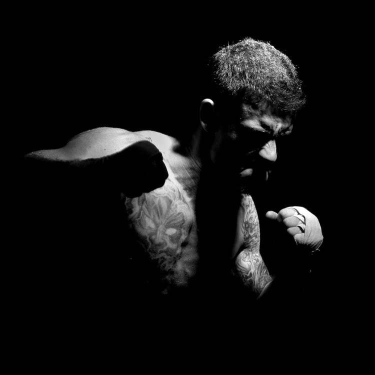
Brent: Alright Guys, so this black and white is one of the first images I took in my makeshift studio. I was just getting into photography. I’ve made myself professionally, basically re-titled myself as a professional photographer. I had a home studio, so basically just in the living room, I’ve moved the couch and everything, have two lights and I think I only have one light at this stage. And I’ve got this guy, a local boxer, quite a mean looking dude. He’s a surfer too and he’s going for a contest. He was training for a contest and I wrote to him and his buddy, his sparring partner to come into the studio and box. I just went and put the lights up and high up. Looking down at him and I just got them to box each other and to punch towards me and I kept this image and I really loved it because I don’t know. There’s something about it that’s just really mean looking. You can see the expression of his face and what you can see of it is, I mean, he’s really mean looking. He’s got this big tattoo on his chest looks like a devil. You can just see the eyes and then one of his fist is actually silhouetted against his chest and then you can see his other fist lit up. So, something like I said about it is fearful or mean or angry kind of image and that’s what I love about it. And black and white just totally makes it for me.
Johny: Yeah, and it’s really contrasted too isn’t it? I mean, the thing I love about it is it’s not standard main image, you know. It’s not standard and you can’t even see his face and I’m thinking that’s what adds to it for me. Actually you know what? For this portrait, it’s not his face that stands out to me. The devil is the point of interest. The devil is definitely the point of interest and I think that’s why it appeals to me so much because normally when you’re shooting portraits it’s all about the face and the features and the expression and what’s going on but for me it’s actually the devil that’s the point of interest. I love that, Man. That’s what really makes it stand out for me.
Brent: And also for me is what you can’t see that actually brings out the mystery of this image and it does not have to be perfectly done every time but there’s a lot of black in there. Actually, it’s mostly black and just a little bit of light and that actually tells a story. So, you see the devil and you see that fist that’s about to come and smack you. You’re going to get a devil punch, Man!
Johny: Cool, Man.
Brent: So, Buddy, inspire us with your black and white image.
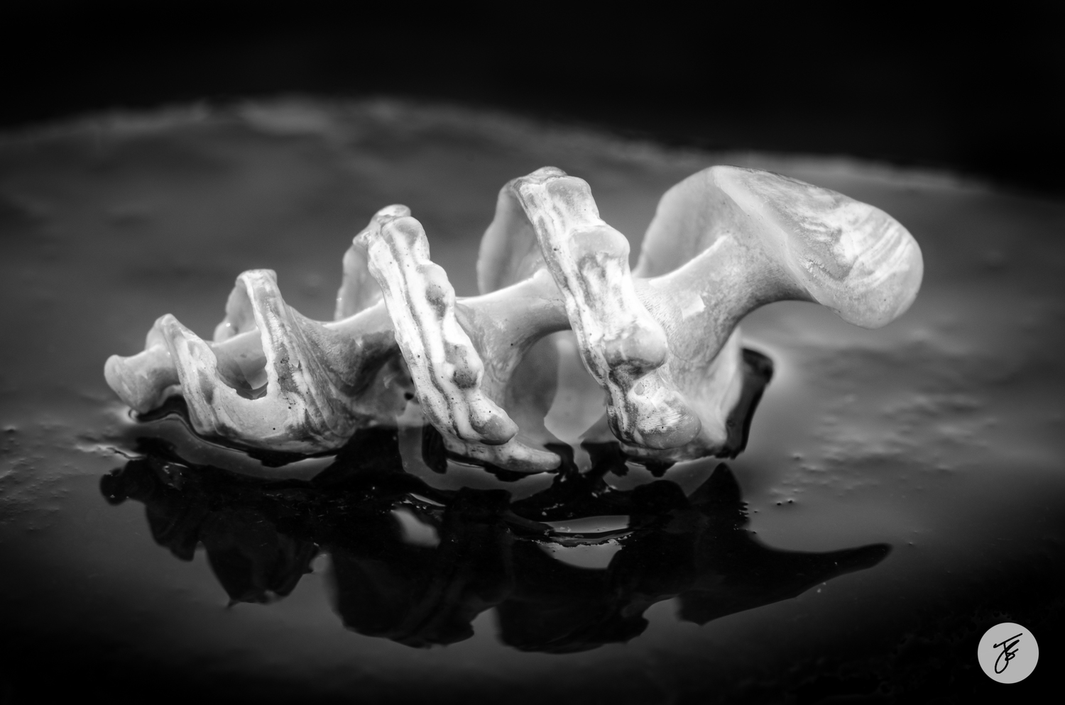
Johny: So, mine is just another really high contrast and just the way it ended up. This actually a shell and what’s happened to the shell is it’s been washed around the rocks, Brent. And all the outside is cracked off and what’s left is the skeleton of the shell, only on the inside. It was one of those afternoons where I went out to shoot sunset and I could tell there wasn’t many clouds, it wasn’t going to happen. So I went and walked around to find a detail and it just happened that I stumbled across and this is something when you go out for your photography Guys, keep your eyes open, look around because even though there isn’t an amazing sunset or something awesome going on, there is always something to photograph. Always something when you’re out there, you know, when you’re doing landscape photography.
Brent: Yeah, and sometimes you actually have to look at your Apps for weather to see where the sun is setting.
Johny: Yes, definitely!
Brent: Often the light shows behind you.
Johny: Yeah, so that’s another thing and good point too. When you’re out, you’re scouting and you look for the sun’s direction and say, “Yeah, that’s where I’m going. I’m shooting with the sun”, and you get out there and the clouds are off. The sun is setting in the west and the clouds are off.
Brent: I’ll say the Northern Hemisphere because it’s in the west.
Johny: On different planets it sets differently. Yeah, anyway, the clouds are in the east. That’s what I was going to say, on a sunset and the sun is setting in the west.
Brent: I think in the Northern Hemisphere also. Northern Hemisphere and the clouds are also in the east.
Johny: Stop the show… Coffee…
Brent: We’ll continue.
Johny: We’ll continue, anyway, the sun is setting on one side and the clouds are on the opposite side. Take a good look at the opposite side. Not only is it easy to photograph because the dynamic range is strong, looking straight into the sun and you usually capture everything in one shot. Foreground all the way to the background, it’s often just as pretty, Mate! Those tones you get away from the sun are gorgeous.
Brent: Alright, let’s go back into your black and white.
Johny: Anyway, back into my black and white. The sun wasn’t setting yet and I found a little pebble about this big sort of size and it was black and I had a water bubble, so I put the pebble down on a rock. I got a water bubble with the pebble not with the shell so that’s given me a little reflection on the foreground and then I’ve lined the shell up and I’ve got down to the level of the shell and I’m photographing it with my macro lens directly at the shell. So that’s the setup and I did set this up and there’s nothing wrong with that. This was just lying there randomly around the rocks. I put them back where I found them you know? It’s not like I ripped out a tree and moved a twig or you know. I’ll never recommend harming nature or moving things around which shouldn’t be moving around but it’s okay to set things up you know, leaves and different stuff. So anyway, it was a setup shot and you can see what I’ve actually ended up with, it’s actually frontlit.
Brent: Oh, okay, so it was facing west?
Johny: I don’t know which way it’s facing. But you can see it’s pretty much lit from the front. Also, just to give a bit of depth, I just wanted to get those front bits of the spines in focus so you can see the sort of folded areas and so that’s the bits that I wanted in focus. I wanted to get a shout out in the foreground just to add an extra bit of interest, so hence the water, okay? I remember this day, actually, I’ll tell you it was a big cloudy day and there was no break in the clouds. It was a big gray afternoon.
Brent: So you changed the story?
Johny: Yeah, I changed the story. I remember now because I didn’t actually defuse any of the light over this. So it’s just all natural, so it’s a bit softer. Yeah,I remember that day.
Brent: And I love that shadow! That makes it for me or the reflection I should say.
Johny: Yeah, reflection is great. So, as far as the two things about this image is that it always reminds me to always have a good look around. It’s not always about the sunset when you’re out doing landscape photography and don’t be afraid to set things up as long as it’s not harming nature. Set it up and then create something on your own because it’s part of the process. Part of being an artist is putting things where you want it. So, to be honest, with the post processing, this ring that you can see is actually the edge of the stone but I’ve darkened down the edge, that’s all! It was light outside and I thought about that when I was shooting it. I thought it’s going to pull too much away from the subject. So, I’ve darkened that whole area around there. So anyway, something to be interested about.
Brent: Inspiring, Man. What an image! Thanks for giving us the tip and also the water. I love the tip about the water. Wet things, because it really does.
Johny: Makes a huge difference.
Brent: Yeah.
Johny: Especially macro. Man, it’s really good.
Brent: I remember when we’re in New Zealand with Jay and Varina and we were photographing those mushrooms. We were taking water bottles that we were supposed to drink but it was freezing cold in the morning and just dripping it unto the mushrooms.
Johny: Yeah, with fast shutter speed and freezing as it drops on the mushroom.
Brent and Johny: Awesome!
How to split tone your monochrome images
Johny: Alright, Guys! I’ve got a little tip for you about Lightroom and the split toning panel. Not a lot of people use it or know about it and this is a bit confusing. What it’s actually named and I’ve got to work this down, it’s a really fun thing for toning. What it basically does is you get to choose the color value for the highlight and a color value for the shadows, okay. So, say the color values that a lot of people use will be yellowy on high light, yellowy color and blue colored.
Brent: As a cool shadows and highlights.
Johny: Warm highlights. That’s the standard sort of split tone that you’ll see and that’s what some of us do today. But you can play around and use all the colors you want but doing this, it’s a real subtle thing. It’s not a big thing and it’s really fun when you start toning your black and white images because it creates some really lovely moods. Classic example is like snow capped mountains, okay. And that little bit of blue tone, you kind of get that cold feeling, you know. I’ve got a lovely image from New Zealand and it just pops right into my head when I talk about that.
Brent: Malcolm? Is it Malcolm?
Johny: I can’t remember.
Brent: Okay.
Johny: One of the mountains. Snow covered mountain. I don’t remember. Sorry! So, toning your images in black and white is really fun. Let’s jump into the screencast and I’ll explain split toning. It’s called straining the Lightroom and it’s really fun to use. So, I’ve got my image here.
Brent: By the way Guys, Johny is using the Wacom.
Johny: The Wacom.This is the Intuos Pro Small. So, I like it because it is small. It’s the same footprint as my laptop which is great. It means it fits in the laptop bag with this one. If you go to the medium, it’s about the same as a 15 inch laptop but you know the thing. I’ve got a 15 inch at work, it is a bonus tip. I’ve got 15 inch at work but I only use about half the surface because it’s too big.
Brent: With the entire screen.
Johny: No, I love the screen but you couldn’t move your arm too far even with that whole screen. So, Man, I love the small. Small is like the perfect size for me. Anyway, let’s jump over there. I always have side notes.
Brent: No, that’s good.
Johny: Yeah, anyway, at least there’s no north, south, east and west on this one. So it’s good. Alright, so I’m in the develop.
Brent: There’s north and the camera.
Johny: Really? Hi north. Anyway, just kidding. Alright, let’s get into this. Alright, into the screencast, let’s get into it.
Brent: Okay.
Johny: Alright Guys, so I’m in the develop module. Doesn’t matter which version of Lightroom you’ve got, jump into the develop module, it will be there. If you don’t see split toning, right click on this gray area here or click in here and turn it on. Maybe it’s been un-clicked for some reason. I’d say in the list of your panels that’s where it will be. So the first thing you can see, I’ll just walk you through these different sliders here, it’s a little bit confusing but let’s do it. So, the first thing here if you click on the palette, it’s going to be a color palette and we can select the color that we want to use for the highlight. The next thing is that’s just the sliding. You can move through the color palette but saturation is the amount of that tone that will show up in the shadow. So in the highlights, right? So, I’ll show you what I mean. Saturation is like the intensity of the color in your highlights. So, the balance is exactly what it says. It’s the balance between the color of the highlights and the color of the shadows. So it’s balanced out. So, sometimes you might want to make it feel a little bit cooler, sometimes you want to make it feel a little bit warmer or whatever tone you choose for the highlights and the shadows that’s what balance does, okay. And the sliding and the shadow side as well. Let’s jump in here. I’m going to pick something. Don’t worry about this like, “What is he doing?”, and start freaking out but I’m just going to pick something a bit yellowy, okay. So, now I will choose the blue value, okay. And you might be thinking, “Where is he going with this?”. And you know what? I’ll probably over expose this but I’m just going to put this all back after I show you. Alright, back in the split toning. So, I chose the two color values I’m going to go with and of course you can go back in and move this around and go crazy but yeah, this look really good in blue and obviously that’s way too over the top. Way, way too over the top so, I’m going to pull this right back. I just want it to be subtle toning in here, you know? I’m going to do something like that, so you may think, “Well, it doesn’t look like you’ve done too much”, but if you turn it off and on and look at that tone. You can definitely see it! I actually think the blue is between dominant now so I’m going to play with the balance. I’m going to pull this toward the low side and see it’s intensifying those yellows on the highlight there. So, if I move that over, it makes everything yellow or everything blue. If I start moving towards that side but I think maybe the blue is a little bit too blue.
Brent: Yeah.
Johny: So, somewhere there. So, I’ve taken the image from a flat monochrome and added just a color. It’s really nice. It is fun playing with the highlights and the shadows, adding the different colors to it. It gives you a new look on your images.
Brent: Totally!
Johny: It’s a really cool tool and like I said, it can be a little confusing when you first look and you’re like, “What?”, you know, so it should be named exactly what it does and so basically the word for you is you chose a color for your highlights, you chose a color for your shadows, you adjust the intensity which is the saturation slider on each value and then you chose a balance between them and that gives you that nice little tones.
Brent: Well, I’ve learned something new. It’s great!
Johny: Yeah, it’s really fun, Man. Split toning is really fun. I think it’s been around for awhile as a technique but if you’ve never tried it, jump right in and have a go because I think it’s awesome.
Brent: And actually, I remember when I was interviewing Jaime from Texas and he does all the model photography and we actually got one of the SIC shows. Johny and I interviewed him. He does exactly that. He does warm the highlights and cools the shadows or maybe he does the opposite. Warms the shadows and cools the highlights.
Johny: Yeah! There’s nothing wrong with that. I mean, obviously in the end when you’re getting down to this models and changes like these right at the end. What am I thinking of, Man?
Brent: Creative?
Johny: Yeah! Your creative juices can come out and create something that you love. It is the final touch that makes the image yours. Cool, Man!
Brent: Well, thanks Johny and it’s been an epic show as Johny says.
Johny: Don’t ask me about directions because I’ll get totally confused. Where’s the camera?
Brent: Yeah, so Guys, we’ve gone through the assignments, the black and white that we’ve just done recently and thank you everyone for putting your images in and commenting on other images. It’s awesome and we love it.
Johny: Get involved! That is the only way you can learn. If you get involved in the community that’s there to support you and help you out.
Brent: And that’s how you learn. Actually, commenting on other images, you actually learn more about their images and about yours.
Johny: Yeah! Breaking images down and the thing you like about the image or the things you dislike about an image that you would have done differently is the best way to learn, it really is, Man!
Brent: For sure, and then Johny has inspired us with an amazing shell image and told us how he photographed it.
Johny: Yeah, and that awesome boxer of yours, Man. Makes me want to go down to the gym you know? I might get good with that, Man. No, I’m joking. They’ll laugh. Apparently, I’m done with heavies. I’ve been told by the boss.
Brent: I’m scared of needles. I’m not going anywhere.
Johny: Needles? Anyway, I’m not going to tell the story. So, anyway Man, it’s been epic and that split toning Guys, check it out. It’s built straight in the Lightroom and it’s awesome. So, hey, actually, how do you do your black and white image?
Brent: I use the Nik Silver Efex.
Johny: I mean, Silver Efex is a great tool for doing a black and white. I really love it and all the different toning in there that you can get. Really, really creative and the toggle and the dust pencil, awesome. Because you don’t need to buy that plugin, it is built right into the Photoshop. it’s built right into the Lightroom. If you have those tools, you can still create great black and whites. Yeah! Cool, Man!
Brent: Awesome Guys, we’ll catch you next week.
Johny: Yeah, see you Guys!
Brent and Johny: Bye!